Love & Flour, VA
Mission———
Love and Flour, Virginia stands as a local home bakery situated in Waynesboro, VA. It was established by a nurse with a profound passion for baking. The bakery’s core mission revolves around crafting and curating delightful baked goods, tailored to their clients’ needs, regardless of the occasion’s scale. Their philosophy is rooted in the belief that food has the power to convey love and create lasting memories.
Project overview———
I collaborated with Love & Flour to develop a brand identity that authentically captured the baker’s passion and overarching mission of crafting a diverse array of confections to elevate any client’s special moments. Within this partnership, my role encompassed crafting a distinct logo mark and a comprehensive brand identity. This involved creating a unique emblem, a range of stationery essentials, and compelling assets tailored for their social media presence.
Project tactics and deliverables included
- Brand Assessment
- Market Research
- Competitor Analysis
- Creative Brief
In our partnership with Love and Flour, VA, we began with a strategic approach; delving into the market dynamics, industry achievements, challenges, and the client’s goals. Our research yielded crucial insights that laid the groundwork for transforming the brand concept into reality.
First, we pinpointed the needs and demographics of their ideal clients, allowing for a better understanding of the target audience. By studying thriving bakeries for positioning, we conducted a competitor analysis, providing valuable insights to strategically define Love & Flour’s niche. Throughout this research process, we adhered to a creative brief in order to align market values with internal desires; working as a guiding tool that helped us capture and comprehend the founders envisioned essence for the brand.
In this foundational phase, these actions collectively established the groundwork, ensuring that Love and Flour, VA’s aspirations are firmly rooted in market understanding and strategic finesse.
The project’s success envisions a new brand identity will not only fuel the bakery’s hard launch but also entice potential clients through a sophisticated aesthetic that embodies the quality and value of their products. At the heart of this transformation lies the brand mark, acting as the driving force behind the brand’s evolution across marketing and social channels. This ensures a heightened stance in the local market, establishing Love & Flour as a more sought-after bakery.
Deliverables included
- Three logo concepts
- Selection of color palettes
- Typography selection
- Branding sheet & guidelines
- Use case iconography
- Final logo files both horizontal and vertical (PNG, EPS, SVG, JPG)
Tools Used
- Adobe Illustrator
- Adobe Photoshop
- Adobe Indesign
Utilizing the knowledge gained during the research and discovery phase, the next step involved leveraging the identified key findings and preferences to initiate the conceptualization of Love & Flour, VA, branding. The objective was to strategically represent their value and quality of work, through a single multifunctional logo mark. The established logo mark would then function as the foundational building block of the brand identity.
Three distinct concepts were presented, each carefully crafted with core elements that ensured the logo mark could be readily comprehended while minimizing the need for additional context to understand the brand’s industry representation.
When designing logos, I believe it is important to start with greyscale designs. This helps ensure that the logo works well in different environments and applications. If a logo doesn’t function well in a single color, it may not meet basic requirements in various contexts. Once I have established the core conceptual elements to build the logo marks around, I begin with sketches, then utilize illustrator to build out all my ideas and see how various selections evolve, I select the best three or four to present. Use insight gained during the discovery phase to select various color palettes and typography that complement each logo mark. In this case, three logo marks were created, along with two color palettes, and three font families were selected.
The main objective throughout the logo design process was to create a sense of artisanal craftsmanship and irresistible allure within each proposed concept. In selecting color palettes and typography, I intentionally chose strong/sturdy combinations to bring a sense of balance and reliability within each logo mark. Of the proposed works one was selected, along with the palette and complimentary typography to create a basis for the brand identity that would be built out in the supporting marketing and social collateral.


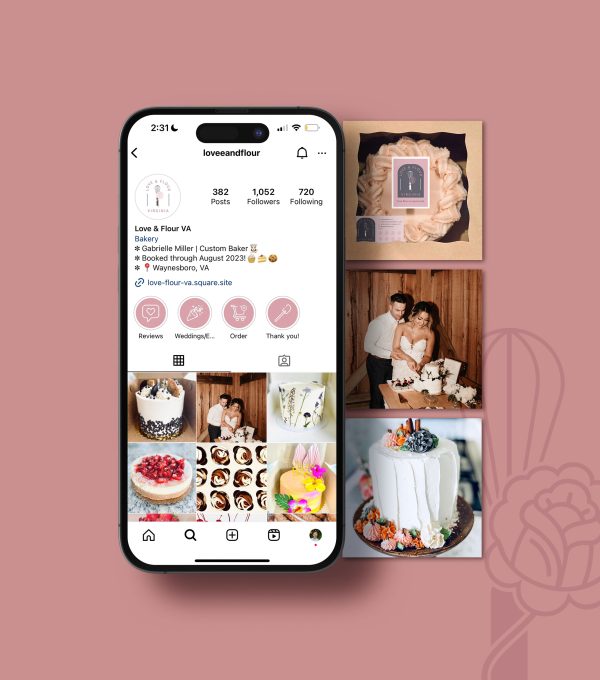
Working with Love and Flour Bakery, we developed a brand that captures the charm and heart behind their baked goods. From logo design to social media, we built a consistent identity that truly connects our baker with their sweet craving community. Even on a tight budget, we delivered a polished look across all platforms. With this update, Love and Flour has become a familiar name in Waynesboro, VA, in just a year and has expanded into catering—even hosting events as large as weddings—embracing their warmth, quality, and authenticity.


